Every interior shoot has its own rhythm. Some are fast, some are layered, and some quietly demand time — not because the space is complicated, but because it deserves to be understood properly. This corporate interior photography project, executed in collaboration with Green Square Turnkey Solutions and coordinated by Pranali Santosh Shinde, was very much the latter.
From the moment I walked into the workspace, it was clear this wasn’t an office designed to make a loud impression. Instead, it was a space built on restraint — clean lines, subtle material choices, and a calm executive tone that revealed itself gradually. Photographing such an environment requires slowing down, observing how light behaves, and respecting the design intent rather than forcing visual drama.
This article is a reflection on that experience — not just the final images, but the decisions, challenges, and quiet details that shaped the shoot.
First Impressions of a Calm, Executive Office Design
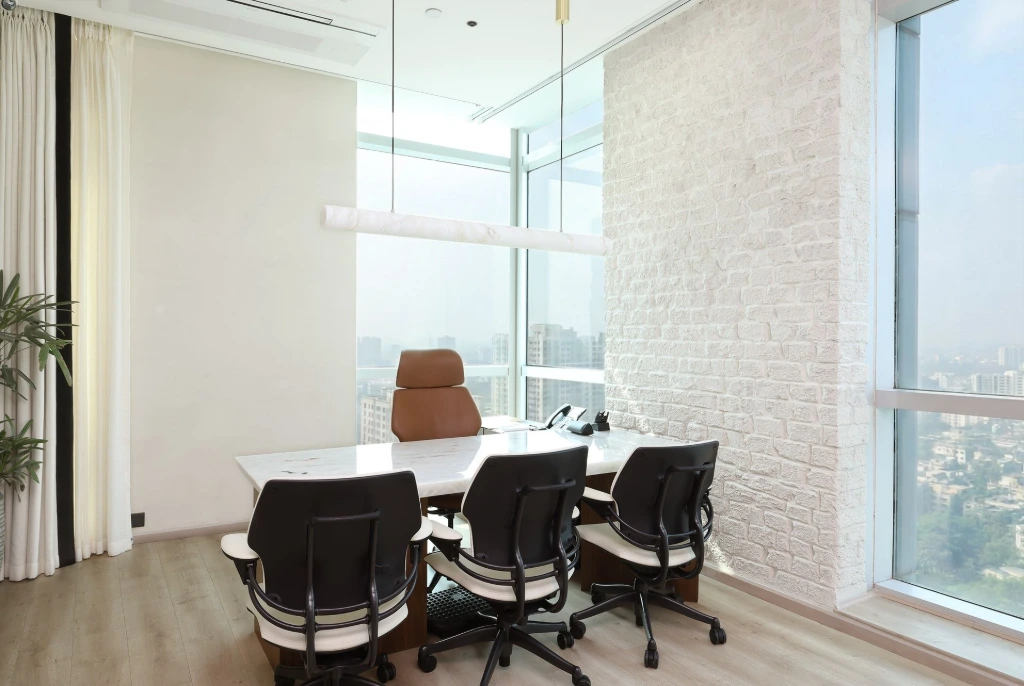
What immediately stood out about this office was its balance. The interiors were clearly premium but never over-designed. Walls were treated with intention, not decoration. Finishes were elegant without being attention-seeking. The overall language of the space leaned toward clarity and comfort—exactly what a modern corporate environment should feel like.
Green Square’s design approach here felt deliberate. Nothing seemed added for effect. Each element had a reason to exist, whether it was a wall panel, a shelving detail, or the way circulation was planned across cabins and shared spaces. This kind of design doesn’t try to photograph itself, which, ironically, makes it more rewarding to shoot.
As an interior photographer, I find this kind of space inviting. You don’t rush through frames. You take time to understand how the room wants to be seen.
Curtains, Light, and the Changing Mood of the Office
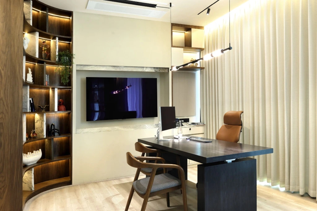
One of the most defining features of this workspace was the extensive use of automatic curtains, installed across cabins and key areas. Almost every room had a double-layer curtain system—a sheer layer and a heavier fabric behind it.
With the curtains open, the office felt bright, white, and energetic. Natural light flooded in, giving the cabins an airy, contemporary feel. The workspace looked active, transparent, and open—ideal for a daytime corporate environment.
When the heavier curtains were drawn, the mood shifted completely. The same cabins suddenly felt warmer, calmer, and more focused. The light softened. The space became quieter and more executive—almost boardroom-like in character. It was fascinating to see how one design element could redefine the personality of an entire office.
Photographing this meant treating each space almost like two different interiors. White balance, color temperature, and exposure had to be carefully adjusted to respect both moods. Capturing these transitions took time, but skipping them would have meant missing an essential part of the design story.
An Open Ceiling That Made the Office Feel Spacious
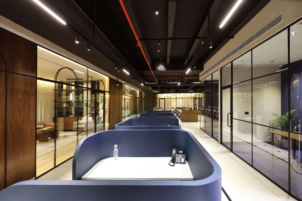
Another distinctive design decision was the absence of a false ceiling. Instead, the office featured an open ceiling with neatly organized black surfaces, executed with remarkable discipline.
Often, open ceilings can feel chaotic or visually heavy if not handled carefully. Here, however, the services were aligned cleanly, creating structure without clutter. The result was a workspace that felt taller, more breathable, and far less congested than conventional corporate interiors.
From a photography standpoint, this openness helped the spaces feel expansive in frame. Lines remained clean. Perspectives stayed balanced. The ceiling never competed with the interiors below it—it simply supported the overall sense of volume.
This is a subtle design choice, but one that contributes immensely to how the office is perceived, both in person and through photographs.
Photographing Every Cabin Without Creative Shortcuts
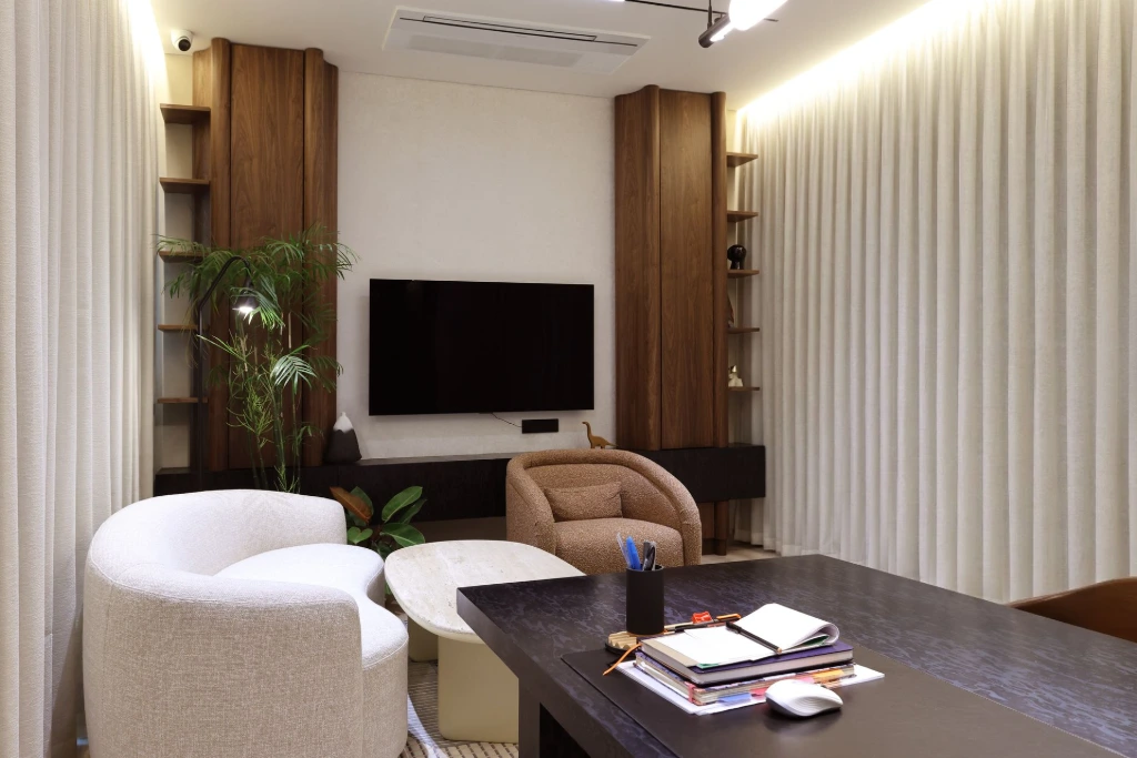
One of the realities of this shoot was the absence of on-site creative approvals during the process. In such situations, a photographer has two choices: take minimal shots and move quickly, or take responsibility for completeness.
I chose the latter.
Each cabin was photographed from multiple angles. Every space was captured with curtains both open and closed. This wasn’t about excess—it was about ensuring that no design detail, mood, or spatial relationship was left undocumented.
When you don’t have someone making real-time creative calls, the safest and most professional approach is to photograph everything properly. That way, selection can happen later with clarity, rather than regret.
This approach naturally increased the number of final frames and extended the shoot duration, but it ensured that the project was covered thoroughly and respectfully.
Shared Areas and the Cafeteria Experience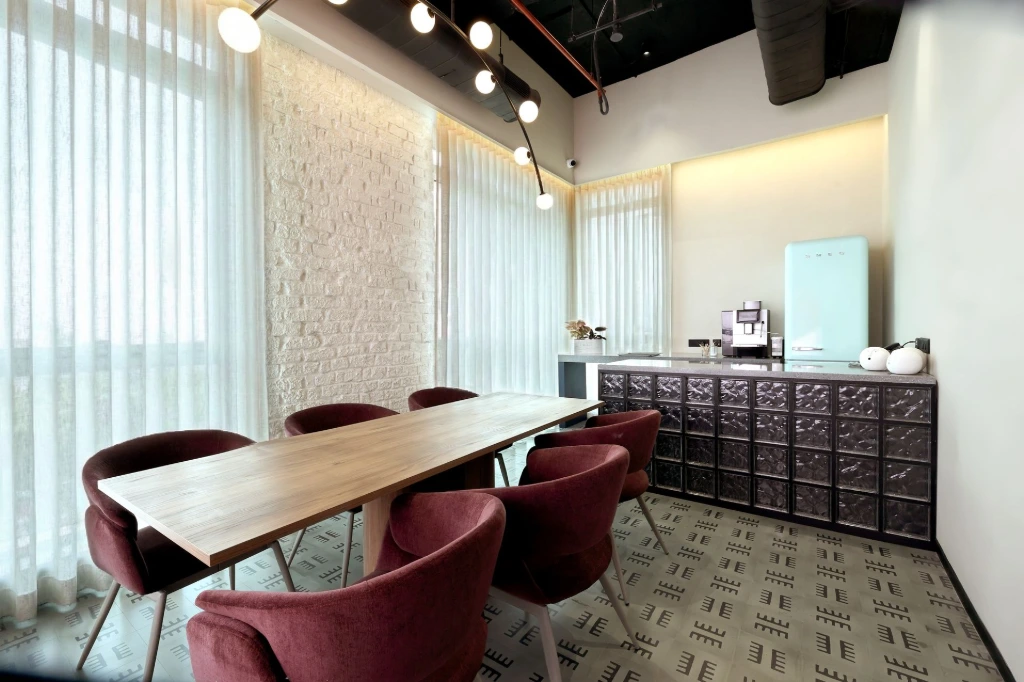
Beyond the cabins, the shared spaces and cafeteria were equally well thought out. These areas carried the same design language—clean, modern, and quietly refined.
The cafeteria, in particular, struck a balance between functionality and warmth. Lighting was comfortable rather than dramatic. Materials felt inviting without breaking the corporate tone. These are the spaces where employees pause, interact, and reset—and the design reflected that purpose.
Photographing these zones required a softer approach, allowing the spaces to feel lived-in without staging them excessively. The goal was to show how the office supports people, not just processes.
Post-Production: When Selection Takes More Time Than Editing
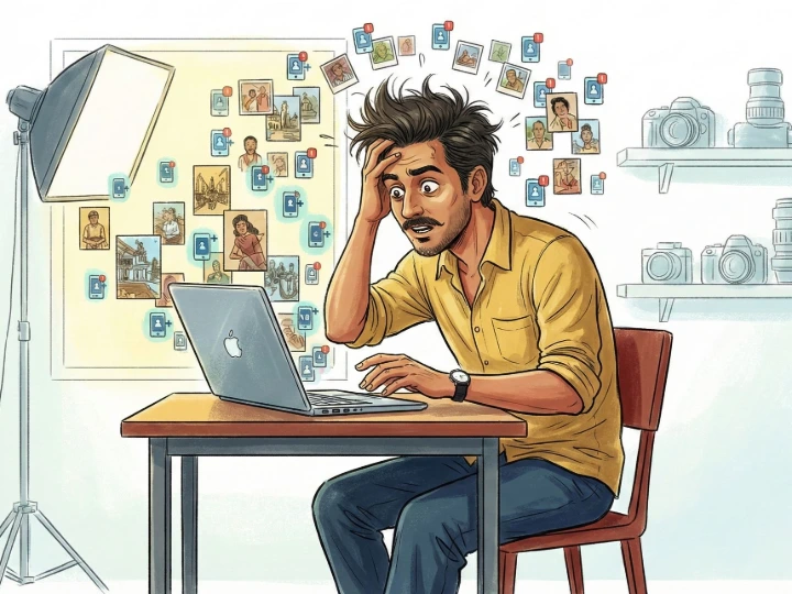
Once the shoot was complete, the real work shifted to post-production. Interestingly, the challenge here wasn’t fixing images — it was choosing between them.
Because each space had been photographed so comprehensively, there were multiple strong frames for almost every area. Curtain open. Curtain closed. Different angles. Slight variations in light. Selecting the final set took time and careful consideration.
Editing itself was a pleasure rather than a chore. The images didn’t need heavy corrections—they needed restraint. Clean color work, balanced highlights, and consistency across the set were the focus.
For a deeper look into post-shoot workflows and the send everything culture in professional photography, you can read our detailed perspective here.
When post-production takes longer than expected for the right reasons, it’s usually a sign that the shoot itself was successful.
Working with Green Square and Project Coordination
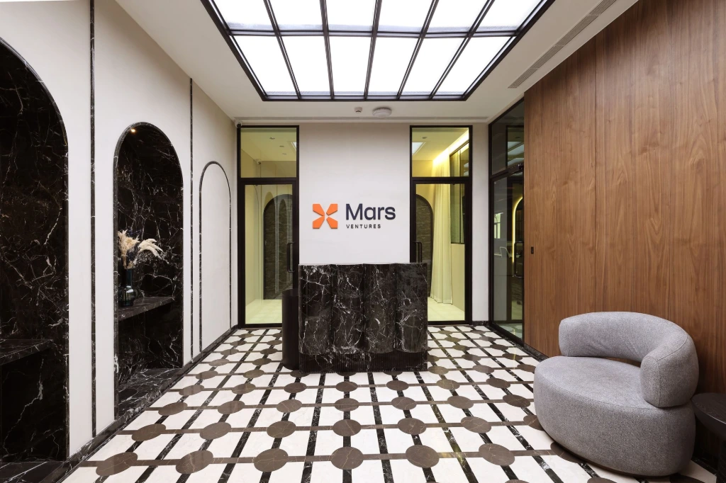
A project like this relies heavily on collaboration, and Green Square’s execution clarity played a significant role in how smoothly the entire shoot progressed. Their design intent translated cleanly on-site, making it easier to understand how spaces were meant to function and feel.
Project coordination by Pranali Santosh Shinde ensured clear communication throughout the process. Her trust in the photography workflow allowed the shoot to unfold without unnecessary pressure, which is invaluable when working in a layered, detail-driven environment.
If you’re looking for professional interior photography in Kolkata for offices, studios, or commercial spaces, you can explore our dedicated service here.
That trust matters. When design teams and photographers work with mutual respect, the outcome naturally improves.
A Satisfying Shoot, Beyond the Frames
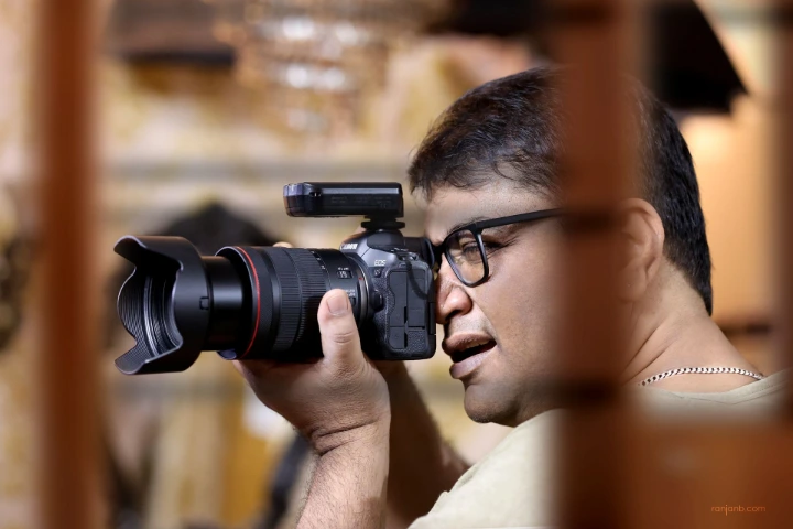
This was not the fastest interior shoot I’ve done, nor was it the simplest. It required time, patience, and attention—both on location and during post-production. But it was also one of the more satisfying ones.
The design was thoughtful. The spaces were elegant. And despite the extra effort involved, the process never felt burdensome because the results justified it.
If the Green Square design team and Pranali ma’am are happy when they see these images, that, for me, is the real measure of success. Interior photography isn’t just about delivering pictures—it’s about honoring the space, the people who designed it, and the intent behind it.